Chart Types and Timeframes: How to Read Trading Charts
Trading charts organise market price data and help traders understand how an asset has moved over time. They can be used to identify the current direction, observe changes in momentum, mark important price levels and prepare a trading plan.
Two settings determine how market information appears:
- The graph type controls how price movement is displayed;
- The timeframe determines how much time is represented by each candle, bar or point.
Atlant Trade provides four graph types: Mountain, Line, Candle and Bar. Each presents the same market movement differently and can be useful at a different stage of analysis.
Key Takeaways
- Mountain and Line graphs provide a clear overview of market direction;
- Candle and Bar graphs display open, high, low and close prices;
- Candle graphs are suitable for detailed price-action analysis;
- Short timeframes show more fluctuations and require faster decisions;
- Higher timeframes provide a broader view of the market;
- Comparing several timeframes can provide stronger context for a trade;
- A timeframe does not automatically determine how long a position should remain open.
How to Change the Graph Type
Open the trading chart and select Type of graph from the chart controls.
The menu contains four options:
- Mountain;
- Line;
- Candle;
- Bar.
Changing the graph type does not change the asset or its market price. It only changes the way price information is displayed.
You can switch between graph types while analysing the same asset. For example, a Mountain graph can help you identify the general direction before you switch to Candle mode for a more detailed analysis.
Mountain Graph
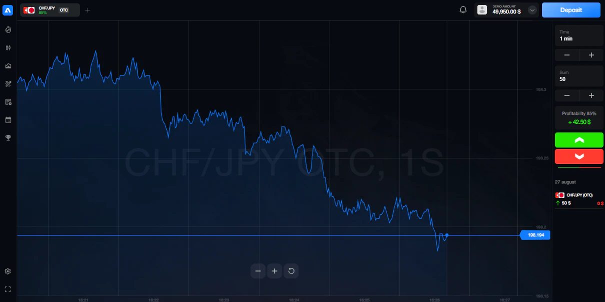
The Mountain graph displays price as a continuous line with the area beneath it filled with colour. The filled area makes the overall direction visually clear and gives the chart its mountain-like appearance.
This graph is useful for:
- Identifying whether price is generally rising or falling;
- Observing the broader trend;
- Finding major turning points;
- Comparing the current price with earlier periods;
- Viewing market movement without unnecessary visual detail.
The Mountain graph is a practical starting point for beginners because it makes the general direction easy to recognise.
However, it does not display all the information available on Candle and Bar graphs. The opening price and the full high-to-low range of each period are not shown separately.
Use the Mountain graph when you want a quick overview of price direction rather than a detailed analysis of individual periods.
Line Graph
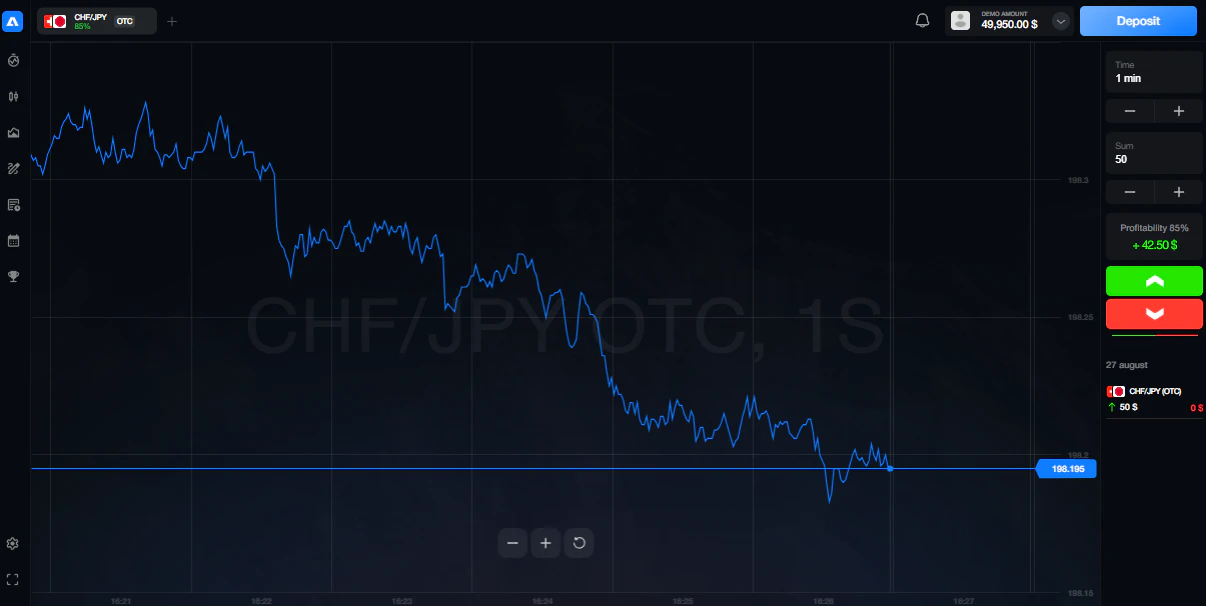
The Line graph connects a sequence of price points with a simple line. Unlike the Mountain graph, the area underneath the line is not filled.
This creates a cleaner and more neutral view of price movement.
The Line graph can help traders:
- Identify the general market direction;
- Observe changes in the slope of price movement;
- Mark significant highs and lows;
- Reduce visual distractions;
- Review a large period of market history.
Mountain and Line graphs contain similar directional information. The main difference is visual presentation: Mountain highlights the area beneath price, while Line displays only the price path.
A Line graph can be useful when the filled area of the Mountain view appears too prominent or when a trader wants a more minimal chart.
Like the Mountain graph, it normally provides less detail than Candle or Bar mode because it does not separately show the open, high, low and close for every period.
Candle Graph
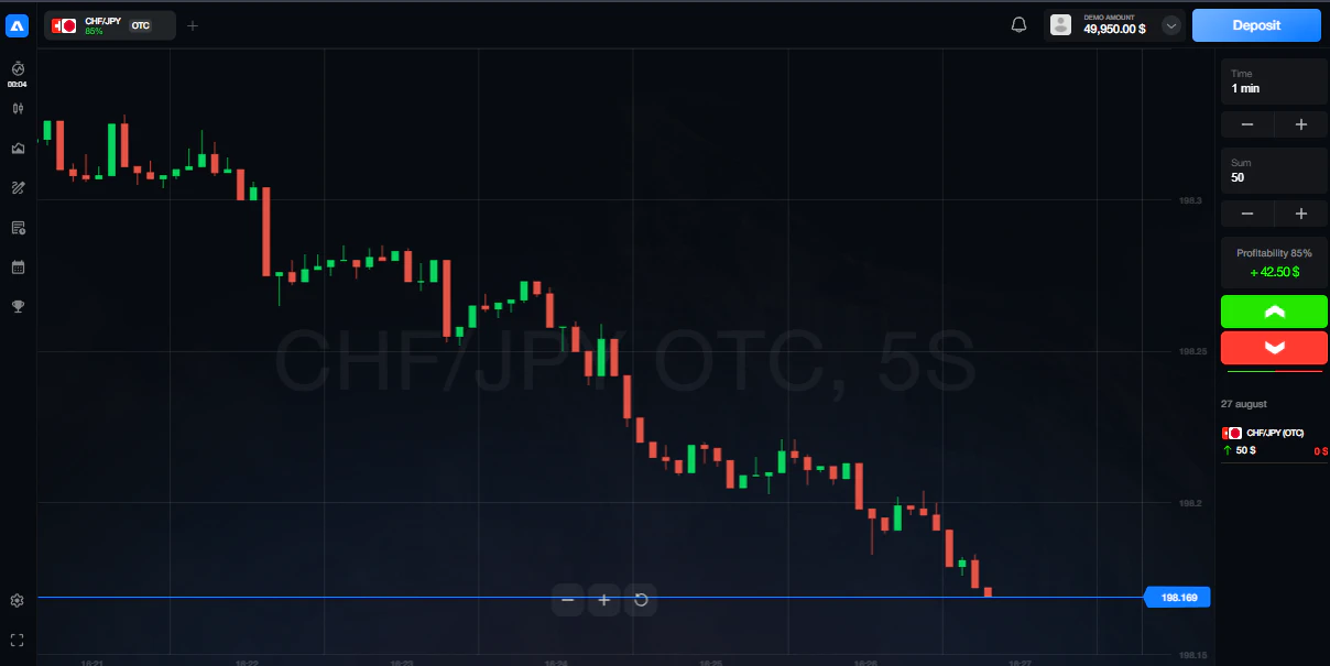
The Candle graph displays price movement using individual candles. Each candle represents the selected timeframe and contains four important prices:
- Open — the price at the beginning of the period;
- High — the highest price reached during the period;
- Low — the lowest price reached during the period;
- Close — the price at the end of the period.
The area between the open and close is called the candle body. The thin lines above and below the body are called wicks or shadows.
A candle that closes above its opening price shows upward movement during that period. A candle that closes below its opening price shows downward movement.
Candle graphs can help traders analyse:
- Buying and selling pressure;
- Price momentum;
- Rejection of higher or lower prices;
- Trend continuation;
- Possible reversal areas;
- Reactions near support and resistance;
- Changes in market volatility.
Candles can also form recognisable patterns, including:
- Doji;
- Hammer;
- Shooting star;
- Bullish engulfing;
- Bearish engulfing;
- Inside bar;
- Morning star;
- Evening star.
The Candle graph provides more information than Mountain or Line mode and is widely used for technical and price-action analysis.
Learn how candle formations work in Candlestick Patterns: How to Read Price Action.
Bar Graph
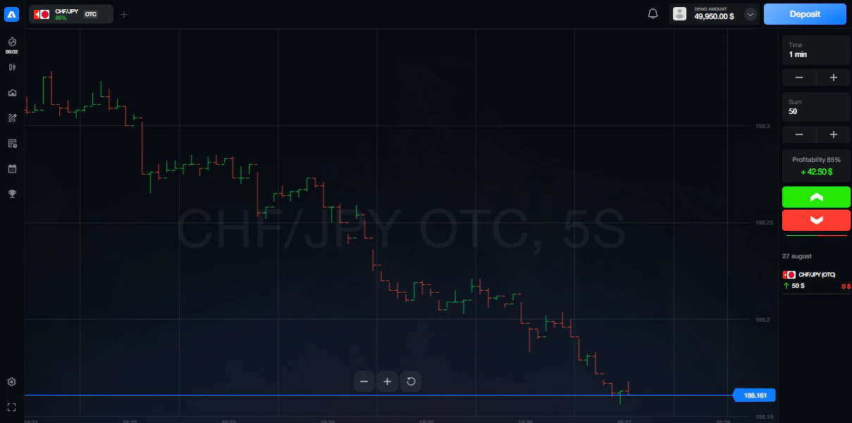
The Bar graph also displays the open, high, low and close for every selected period. Instead of a filled candle body, it uses a vertical line with two short horizontal marks.
A standard price bar contains:
- A vertical line showing the complete high-to-low range;
- A short mark on the left showing the opening price;
- A short mark on the right showing the closing price.
Bar and Candle graphs contain similar price information. The main difference is how that information is presented.
Candle bodies make upward and downward movement visually distinct, while bars provide a more compact view. Some traders prefer bars when they want to display more price periods without large candle bodies occupying the chart.
For beginners, Candle mode may be easier to understand. Bar mode can be useful after the trader becomes comfortable identifying the open, high, low and close.
Comparison of Atlant Trade Graph Types
| Graph type | Information displayed | Main advantage | Suitable for |
| Mountain | General price direction | Clear visual overview | Beginners and initial trend analysis |
| Line | General price direction | Minimal and uncluttered view | Trend analysis and marking major levels |
| Candle | Open, high, low and close | Detailed visual price-action analysis | Patterns, setups and entry confirmation |
| Bar | Open, high, low and close | Detailed information in a compact form | Structured technical analysis |
There is no single graph type that is suitable for every stage of analysis.
A trader may use:
- Mountain or Line mode to observe the general direction;
- Candle mode to examine price action and potential signals;
- Bar mode when a compact display of OHLC information is preferred.
What Is a Trading Timeframe?
A trading timeframe determines how much time is represented by each candle, bar or graph point.
In the Atlant Trade interface, timeframe selection is available through the Select period menu.
The following periods are available:
- 1 second;
- 5 seconds;
- 15 seconds;
- 30 seconds;
- 1 minute;
- 5 minutes;
- 15 minutes;
- 30 minutes.
Changing the period does not change the asset or its current price. It changes how price data is grouped and how much detail appears on the graph.
For example, on the 5-minute period, each candle or bar represents five minutes of price movement. On the 30-minute period, each candle or bar contains price data for 30 minutes.
Second-Based Periods
The 1-second, 5-second, 15-second and 30-second periods provide the most detailed view of immediate price movement available on Atlant Trade.
They can be used to:
- Observe rapid changes in price;
- Monitor short-term volatility;
- Examine how price reacts near a selected level;
- Follow the final stage of a short-term setup;
- Compare immediate movement with the direction shown on a longer period.
Second-based graphs can change rapidly and normally contain more market noise than minute-based graphs. Small movements may appear significant even when they do not change the broader direction.
These periods require faster observation and decision-making. They are most useful when analysed together with a longer available period rather than in isolation.
One-Minute Period
The 1-minute period groups market data into one-minute candles, bars or graph points.
It provides more structure than second-based periods while still displaying detailed short-term movement.
The 1-minute period can be used to:
- Observe recent momentum;
- Analyse a short-term reaction;
- Refine a potential entry area;
- Monitor movement after a signal;
- Compare immediate price action with the 5-minute graph.
Because it remains a short period, the 1-minute graph can still contain frequent fluctuations and incomplete signals.
Five-Minute Period
The 5-minute period offers a balance between detailed price movement and short-term market structure.
It can help traders:
- Identify local trends;
- Observe pullbacks and corrections;
- Evaluate reactions near support and resistance;
- Confirm a setup identified on the 15-minute or 30-minute graph;
- Reduce some of the noise visible on second-based periods.
A trader may use the 5-minute graph to examine a potential entry after identifying the general direction on a longer available period.
Fifteen-Minute Period
The 15-minute period provides a broader view of short-term market movement.
It can be used to:
- Identify a local trend;
- Mark support and resistance zones;
- Observe larger price swings;
- Find potential trading setups;
- Compare the current movement with the 30-minute direction.
The 15-minute graph contains fewer candles or bars than the 1-minute or 5-minute graph over the same amount of time. This makes the general price structure easier to recognise.
Thirty-Minute Period
The 30-minute period provides the broadest market view available in the Atlant Trade period selector.
It can help traders:
- Identify the broader available direction;
- Find important swing highs and lows;
- Mark stronger support and resistance areas;
- Understand the context of shorter-period signals;
- Avoid making decisions based only on immediate fluctuations.
Before analysing a setup on a shorter period, traders can review the 30-minute graph to understand whether price is generally rising, falling or moving sideways.
Comparison of Available Periods
| Period | Level of detail | Common analytical purpose |
| 1–30 seconds | Very high | Observing immediate price changes and short-term volatility |
| 1 minute | High | Refining an entry and monitoring recent momentum |
| 5 minutes | Moderate to high | Examining short-term setups and price reactions |
| 15 minutes | Moderate | Identifying local trends and potential setups |
| 30 minutes | Broadest available view | Understanding market direction and broader price structure |
How to Use Several Periods
Multi-timeframe analysis means checking the same asset on several periods before making a trading decision.
On Atlant Trade, a practical sequence may be:
- Open the 30-minute graph to identify the broader available direction;
- Use the 15-minute graph to locate a potential setup;
- Switch to the 5-minute or 1-minute graph to examine the entry area;
- Use a second-based period only when additional short-term detail is required.
For example:
- The 30-minute graph shows an upward market structure;
- The 15-minute graph shows a pullback toward support;
- The 5-minute graph shows a bullish reaction at that level;
- The 1-minute graph provides a more detailed view of the entry area.
If the 30-minute and 15-minute graphs support the same direction, the setup has clearer context. If they show conflicting movement, the trader can wait until the market structure becomes clearer.
Learn how important price areas are identified in Support and Resistance in Trading.
How to Choose a Graph Type and Period
The selected combination should match the purpose of the analysis.
- Use Mountain or Line with 30 minutes to observe the general direction;
- Use Candle or Bar with 15 minutes to identify a potential setup;
- Use Candle or Bar with 5 minutes or 1 minute to examine the entry area;
- Use second-based periods when immediate price detail is required.
Shorter periods show more price changes, but they do not necessarily provide better signals. The additional movement may represent temporary market noise.
Longer available periods show fewer individual fluctuations and can provide clearer market context.
Practical Chart Analysis Process
Use the following process before considering a position:
- Select the asset;
- Open the 30-minute graph;
- Identify whether price is rising, falling or moving sideways;
- Mark the nearest support and resistance areas;
- Move to the 15-minute graph to locate a possible setup;
- Use the 5-minute or 1-minute graph to examine the entry area;
- Select Candle or Bar mode when detailed OHLC information is required;
- Wait for the selected candle or bar to close;
- Define the entry and invalidation conditions;
- Calculate the maximum acceptable risk before entering.
This sequence helps traders move from the broader available context toward the finer details of a potential entry.
Common Mistakes
Using Only a Second-Based Period
Immediate price movement can appear significant without changing the broader direction. Check the 15-minute or 30-minute graph before evaluating a very short-term signal.
Changing Periods Until a Signal Appears
Repeatedly switching periods until one supports a preferred decision can lead to confirmation bias. Select the analysis periods before looking for an entry.
Ignoring the 30-Minute Direction
A signal on the 1-minute or 5-minute graph may move directly against the broader structure visible on the 30-minute graph.
Entering Before the Candle or Bar Closes
An unfinished candle or bar can change significantly before the selected period ends. A potential signal may disappear by the close.
Confusing More Movement with More Opportunity
Second-based and 1-minute graphs display more fluctuations, but not every movement creates a valid trading setup.
Using Too Many Periods
Checking every available period can create conflicting information. Three related periods are normally sufficient for direction, setup and entry analysis.
Changing the Analysis Period After Entering
Moving to another period simply because the position is moving against the original idea changes the trading plan and can delay a necessary exit.
Frequently Asked Questions
Which Graph Types Are Available on Atlant Trade?
Atlant Trade provides four options in the Type of graph menu: Mountain, Line, Candle and Bar.
Which Periods Are Available on Atlant Trade?
The Select period menu includes 1 second, 5 seconds, 15 seconds, 30 seconds, 1 minute, 5 minutes, 15 minutes and 30 minutes.
Which Graph Type Is Best for Beginners?
Mountain and Line modes provide the simplest view of price direction. Candle mode is useful when the trader is ready to analyse open, high, low and close information.
What Is the Difference Between Mountain and Line?
Both show the general price path. Mountain fills the area beneath the line, while Line displays the movement without a filled area.
What Is the Difference Between Candle and Bar?
Both display open, high, low and close data. Candle mode uses filled bodies, while Bar mode uses vertical lines with marks for the opening and closing prices.
Which Period Provides the Broadest View?
The 30-minute period provides the broadest market view available in the Atlant Trade period selector.
Which Period Shows the Most Detail?
The 1-second period shows the most immediate price detail, but it also contains the largest amount of short-term market noise.
Which Period Can Be Used to Find an Entry?
A trader may use the 30-minute graph for direction, the 15-minute graph for the setup and the 5-minute or 1-minute graph to examine the entry area.
Should Every Available Period Show the Same Direction?
No. Short periods may show temporary movement against the broader structure. The purpose of comparing periods is to understand how short-term price action fits into the wider available context.
Does a Shorter Period Create Better Signals?
No. Shorter periods create more movement and more potential signals, but they also contain more noise and require faster decisions.
Summary
Atlant Trade provides four graph types:
- Mountain;
- Line;
- Candle;
- Bar.
Mountain and Line graphs provide a simplified view of market direction. Candle and Bar graphs display detailed open, high, low and close information.
The available periods are:
- 1 second;
- 5 seconds;
- 15 seconds;
- 30 seconds;
- 1 minute;
- 5 minutes;
- 15 minutes;
- 30 minutes.
The 30-minute period can be used to understand the broader available direction. The 15-minute period can help identify a setup, while the 5-minute or 1-minute period provides additional entry detail.
Combining an appropriate graph type with several related periods can help traders understand market context and make their analysis more structured.
Explore Atlant Trade Graphs and Periods
Use a demo account to compare Mountain, Line, Candle and Bar graphs, explore the available periods and practise analysing price movement using virtual funds.